The problem.
Cuzen Matcha wants to showcase the versatility of matcha to its customers. However, the website experiences low traffic and engagement on its recipe pages, resulting in a loss of visibility and potential customer base. By increasing traffic, the company can increase its customer acquisition.
I increased traffic to Cuzen Matcha's recipe webpage through specific experiential curation, creating an informed experience for matcha enjoyers to browse new recipes.
Hueristic evaluation.
I conducted a hueristic evalution on Cuzen Matcha's initial recipe pages, noting potential pain poins for users. This initial observation also helped me get a feel for how users may navigate through the website.
User research.
Hey there, user!
I conducted a survey to understand the current perceptions and attitudes towards the recipe pages' current design.
At a glance
75%
wanted to see changes to content
66%
agreed the webpage was unneccesarily complex
65%
agreed functions were not well integrated
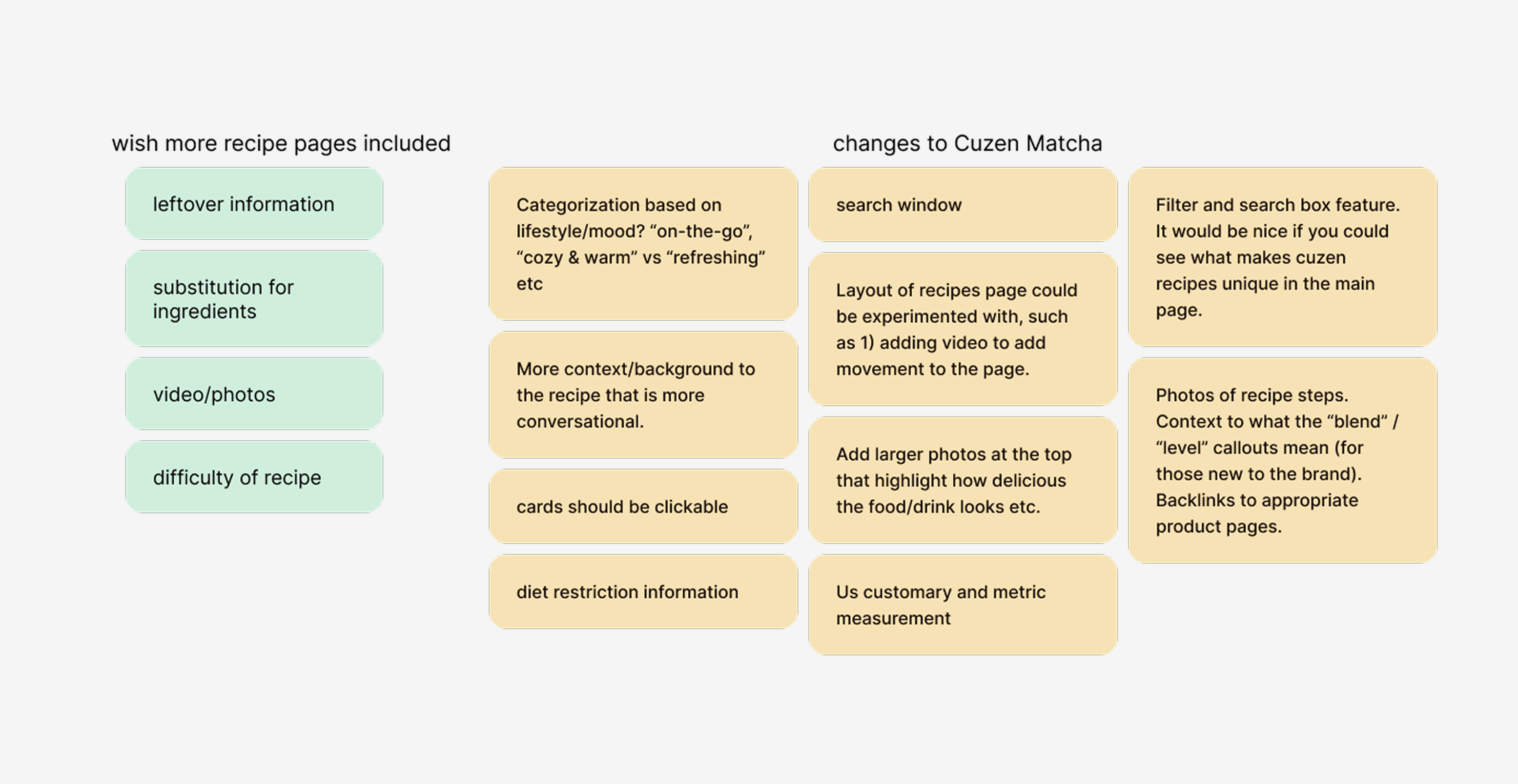
The wants, the needs.
An affinity map was created to consolidate the data collected from the surveys, and organize the information to present to the CEO and Design Director.
Mapping the solutions.
After consulting with the CEO and Design Director, I focused on 4 main features, alongside layout:
Search and filter
Enable users to easily search and locate the desired recipes.
Context to terms
Assist understanding in the terms "blend" and "level" used by Cuzen Match.
Dietary information
Allow users to identify recipes that meet their specific dietary requirements.
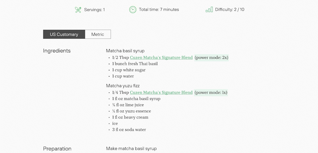
Measurement choice
Allow users to switch between US customary or metric measurements.
Low fidelity ideation.
For quick iteration and brainstorming potential opportunities, I sketched low-fidelity wireframes.
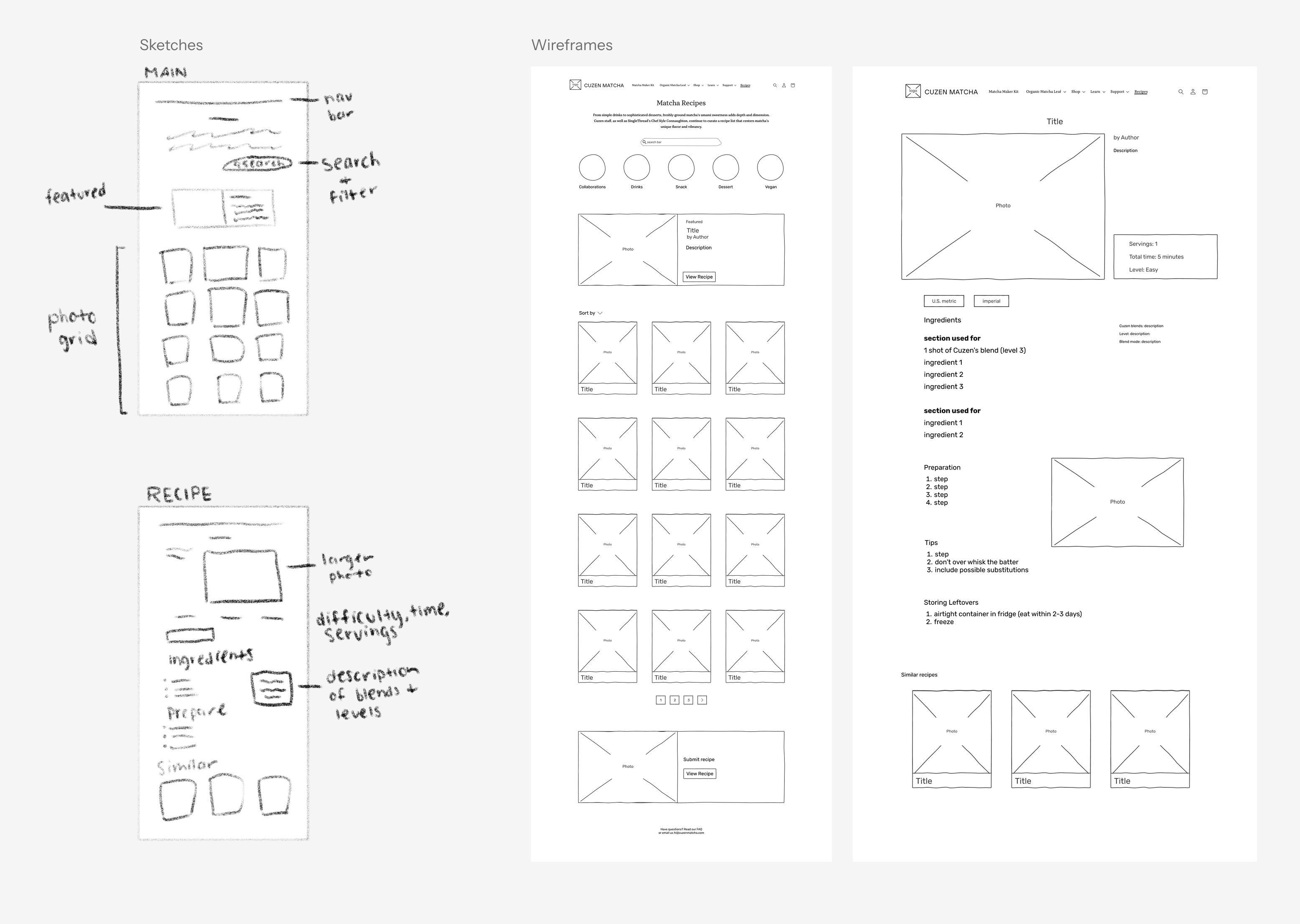
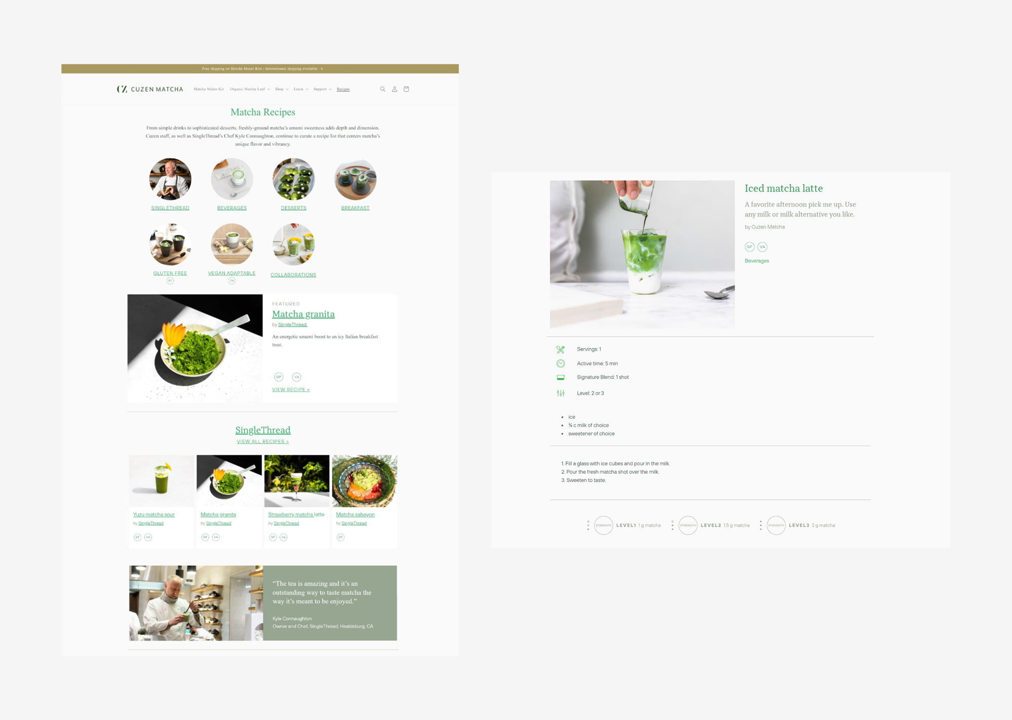
The design.
Navigation
Know exactly what you want? Filter your search to help narrow down options.
I added a filter feature to allow the user to find specific recipes they're looking for.
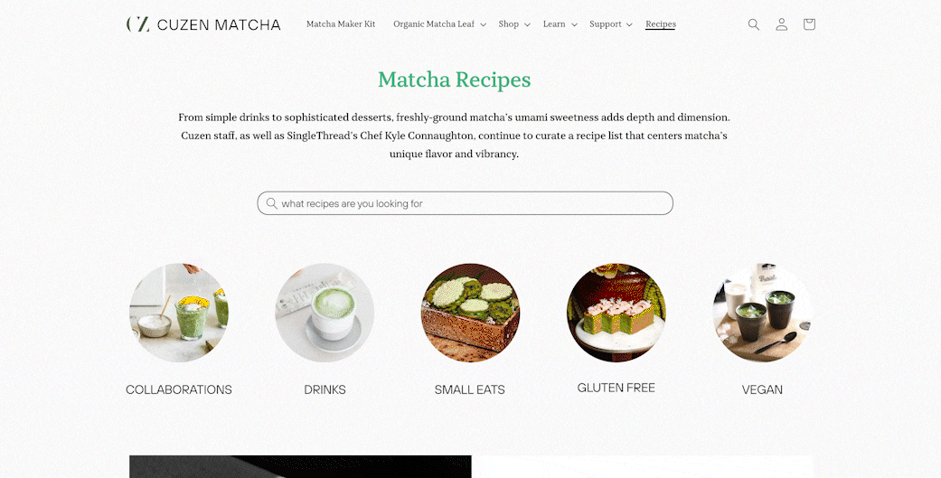
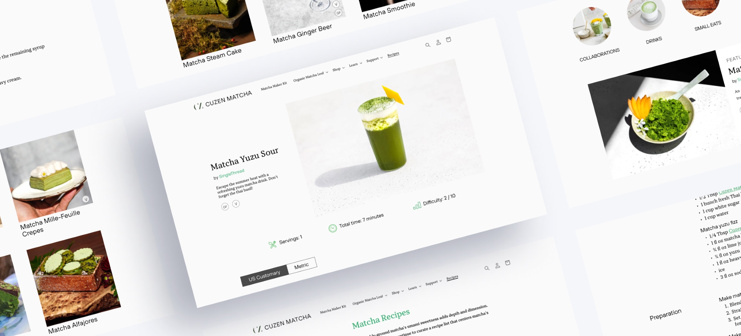
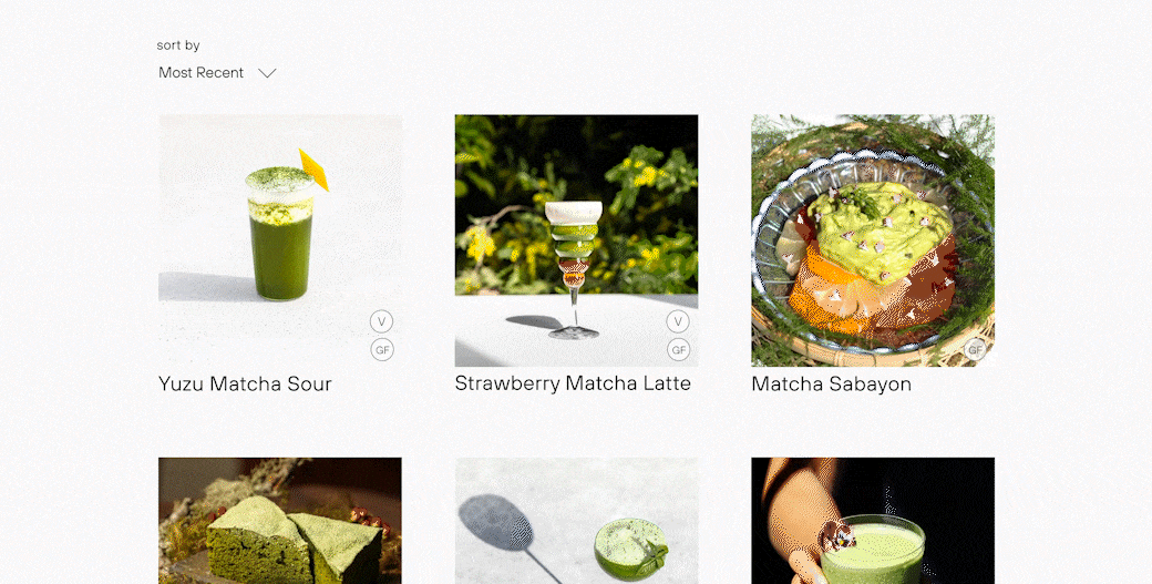
Inventory Page Format
Browse the diverse selection of recipes for your next creation.
With a grid layout, larger photos are shown to emphasize the visual appeal of the recipes. Categories are also simplified to prevent overcrowding.

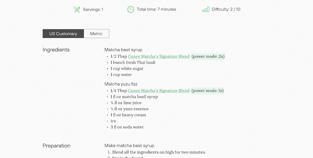
Recipe Page Format
Follow along the recipe, and learn tips and proper leftover storage.
To simplify the design, the recipe page is sectioned by ingredient, preparation, tips, and storage. Similar recipes are also shown if users want to explore more tastes.
US Customary or Metric
Every kitchen is different. Switch between US Customary and Metric to chose the unit of measurement you're comfortable with.
Giving the user options to switch between the two systems of measurements allows Cuzen Matcha to reach a more diverse audience.
Hover Pop-Up
Hover over highlighted text to learn more about common terms used by Cuzen Matcha.
To minimize information overload in the design, information appears through hovering over the highlighted text. Users can click the link to be redirected to a tutorial.
Takeaways.
Project management
With full creative control over the redesign, I quickly learned the importance of time management and structured planning. With only myself to guide the project, I became more responsible for timelines and maintaining a diligent to-do list with self-imposed deadlines. This experience fundamentally improved my organizational skills and my ability to work at an effective pace with design projects.
Learning from others
I actively studied various websites, noting what worked and what didn't in their designs. This studying helped me improve my initial sketch and vision for the webpages. Learning from other designers expanded my design perspectives and inspired diverse UI structural ideas.